


Dashboards fail to drive decisions by emphasizing data over action, lacking context, ownership, and clear decision pathways.
Over the past decade, organizations have invested heavily in data visualization. Dashboards have become the centerpiece of modern analytics. Every leadership meeting has a slide deck. Every department has a dashboard. Every function has a KPI tracker.
Yet, despite this explosion of visual data, one uncomfortable question remains.
Are organizations actually making better decisions?
In many cases, the answer is not as obvious as we would like to believe.
I have sat in numerous executive discussions where multiple dashboards were presented such as sales performance charts, operational metrics, financial summaries and pipeline visuals. The charts were polished and visually impressive. But within minutes, the conversation inevitably shifted away from the dashboards.
The leadership team began asking questions.
- What caused this change?
- Is this temporary or structural?
- What should we do about it?
The dashboards showed patterns, but they rarely answered the questions that mattered most.
That is when I began to realize something important.
The Modern Organization Has No Shortage of Dashboards
Today’s organizations are not suffering from a lack of visualization tools. If anything, the opposite is true.
Modern business intelligence platforms like Power BI, Tableau, Looker and others have made it remarkably easy to build dashboards. Data pipelines feed real-time metrics into beautifully designed visualizations. Filters, drill-down capabilities and interactive charts are available at the click of a button.
From a technological perspective, this is a remarkable achievement.
But an unintended consequence has emerged.
Many organizations now have more dashboards than decisions.
Every team produces reports. Every function tracks metrics. Sales has one set of dashboards, finance another, operations yet another. In theory, this abundance of data should create clarity.
In practice, it often creates noise.
Leaders are inundated with information but still struggle to extract meaning from it.
The problem is not that the charts are wrong. The problem is that charts alone do not provide interpretation.

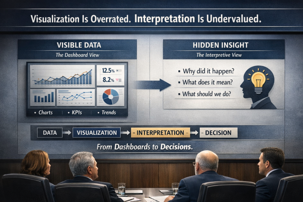
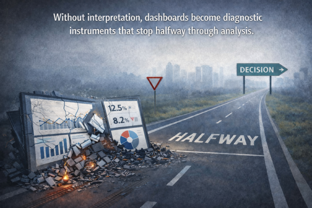
Charts Tell Us What Happened. Leaders Need to Know Why.
Visualization excels at answering descriptive questions.
A dashboard can quickly show that revenue declined by 8% last quarter. It can highlight which region experienced the steepest drop. It can show the trend over the last twelve months.
All of this is useful.
But none of it explains why the decline occurred.
When executives review dashboards, they are rarely looking for descriptive statistics alone. Their questions are inherently interpretive:
- What caused this shift?
- Is this a short-term fluctuation or a structural change?
- Which underlying drivers are responsible?
- What actions should we consider?
Without interpretation, dashboards become diagnostic instruments that stop halfway through the analysis.
The chart shows the symptom. The organization still needs someone to diagnose the cause.
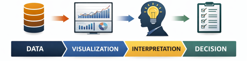
The Missing Layer Between Data and Decisions
In many organizations, the analytics workflow implicitly assumes a simple progression:
Data → Dashboard → Decision.
In reality, there is a critical step missing in the middle.
Data → Visualization → Interpretation → Decision.
Visualization transforms raw data into something readable. Interpretation transforms that information into insight.
The distinction may seem subtle, but its impact is profound.
Consider a common example. A dashboard might show that customer churn increased in the last quarter. The visualization identifies the pattern. But interpretation requires deeper investigation.
Perhaps churn is concentrated among a specific customer segment. Perhaps a pricing change created unexpected sensitivity. Perhaps a competitor launched an aggressive promotion.
Until someone connects the pattern to its underlying drivers, the chart remains incomplete.
Organizations often assume that decision-makers will interpret the charts themselves. In practice, leaders are already managing immense cognitive load. Expecting them to perform analytical interpretation during every meeting is unrealistic.
Interpretation is not an automatic outcome of visualization. It is a separate capability.
The Skill That Organizations Rarely Train
Another reason interpretation is undervalued is that it does not neatly fit into traditional analytics training.
Most data professionals are trained in technical skills. They learn how to write SQL queries, build data models, and design dashboards. They become proficient in visualization tools and statistical techniques.
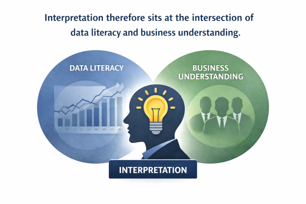
These capabilities are essential. But interpretation requires a different set of competencies.
Interpreting data effectively demands a combination of analytical reasoning and business context. It involves asking better questions, understanding how different parts of the business interact and recognizing which patterns truly matter.
This is closer to investigative thinking than technical reporting.
An analyst who understands the operational realities of a business can identify signals that might otherwise be overlooked. Conversely, a technically sophisticated dashboard created without domain context may display metrics that look impressive but provide limited decision value.
Interpretation therefore sits at the intersection of data literacy and business understanding.
It is a hybrid capability that many organizations assume will emerge naturally, but rarely cultivate intentionally.
Visualization Expands Information. Interpretation Compresses It.
One way to understand the distinction is to consider how each process handles complexity.
Visualization expands information into visual form. Multiple charts display different dimensions of performance. Trends, comparisons and distributions become easier to observe.
Interpretation performs the opposite function.
It compresses complexity into a small number of clear insights.
A dashboard might contain fifteen charts describing sales performance. Interpretation might distill those visuals into a single insight: “The majority of the revenue decline came from two enterprise clients delaying renewal decisions due to budget freezes”.
That statement captures what the charts were attempting to communicate but does so in a form that is directly actionable.
Interpretation therefore acts as a bridge between analysis and decision-making. It converts visual information into a coherent narrative that leaders can engage with.
The Cognitive Load Problem in Executive Decision-Making
Senior leaders operate under constant time pressure. Their schedules are filled with meetings, strategic discussions and operational reviews. Each session often brings a new set of dashboards and reports.
The assumption that leaders will personally analyze every chart in detail is unrealistic.
What executives actually need is not more visualization. They need clarity.
They need to understand:
- What has changed.
- Why it changed.
- What implications the change has for the organization.
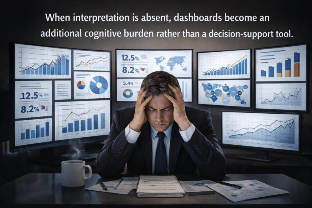
When interpretation is absent, dashboards become an additional cognitive burden rather than a decision-support tool.
The most effective analytics teams recognize this reality. They focus less on producing more charts and more on surfacing the handful of insights that truly matter.
The Role Data Teams Must Begin to Play
If interpretation is so critical, who should be responsible for it?
In my view, analytics teams must evolve beyond the role of dashboard builders. Their role increasingly needs to resemble that of decision partners.
Instead of simply presenting dashboards and expecting leadership to derive meaning from them, data professionals should help frame the insights that emerge from the data.
This does not mean replacing leadership judgment. Rather, it means enabling that judgment with clearer analytical context.
For example, instead of saying: “Here is the dashboard showing regional performance.”
A more valuable contribution would be:
“Three trends stand out in this quarter’s regional performance. Two regions experienced demand contraction linked to distributor inventory buildup, while the third region shows early signals of pricing sensitivity.”
The dashboard still exists. But interpretation directs attention to what matters.
Why Interpretation Will Become Even More Important
The rapid emergence of AI-powered analytics tools is accelerating this shift.
Generative AI and embedded copilots can now create visualizations almost instantly. A manager can simply ask a system to generate a dashboard showing customer trends, revenue performance or operational metrics.
As these capabilities become widespread, visualization will increasingly become commoditized.
The real differentiation will move elsewhere.
Organizations that gain advantage will not be those that create the most dashboards. They will be those that develop the strongest ability to interpret patterns, connect signals across data sources, and frame insights in ways that guide strategic decisions.
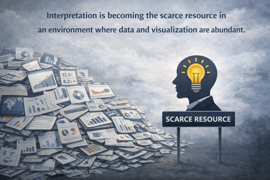
Interpretation is becoming the scarce resource in an environment where data and visualization are abundant.
The Real Measure of Analytics Success
For many years, organizations measured the success of analytics initiatives through operational metrics:
- How many dashboards were created?
- How frequently are reports refreshed?
- How many users access the analytics platform?
These metrics reflect activity, but they do not necessarily reflect impact.
A more meaningful measure would be far simpler.
Did the analysis clarify an important decision?
If data helped leadership understand a complex issue more clearly, challenge assumptions or identify a new strategic option, then analytics delivered real value.
Visualization may have played a role in that process. But interpretation was what ultimately made the insight useful.
Data visualization has unquestionably transformed the way organizations interact with information. It has made data more accessible and transparent than ever before.
But accessibility alone does not create insight.
Charts can reveal patterns. Interpretation reveals meaning.
And in the end, decisions are made not because the data was visible, but because someone helped explain what it truly meant.
Leave a Reply