


An actionable insight clearly answers “what to do next,” linking data to specific decisions, ownership and measurable outcomes.
During my audit days, I worked on a quality control review for a manufacturing organization that was struggling with complaint resolution delays. On paper, the company was already measuring the problem. They had dashboards. They had monthly reports. They tracked turnaround time. They reviewed trends in meetings.
Everything looked monitored. And yet, the delays persisted.
What struck me wasn’t the absence of data. It was the absence of clarity. The organization had information, but it didn’t have insight that compelled action. The problem was visible, but it wasn’t actionable.
That distinction between seeing a problem and isolating it is where most business analysis quietly fails.
I’ve written earlier about how dashboards often give organizations a sense of visibility without improving the quality of decisions. If dashboards were truly solving the problem, executives wouldn’t still be debating the same issues month after month.
Read the article here: If Dashboards Were Really Working, Why Are Executives Still Debating?
This article builds on that foundation by going one layer deeper, into the quality of the analysis itself.
The Illusion of Adequate Analysis
In a previous piece, I argued that dashboards are not the enemy poor decision design is. Dashboards are powerful tools when they are built to support choices instead of just reporting status. But even well-designed dashboards inherit the quality of the analysis behind them. If the analysis is shallow, the dashboard will be too.
Read the article here: Dashboards Are Powerful. Most Are Just Designed Wrong.
The client’s initial reporting was not wrong. In fact, it was clean and well organized.
- Complaint resolution time was tracked as an average.
- Monthly performance was compared against targets.
- SLA compliance percentages were highlighted.
- Trend charts showed gradual deterioration.
If you looked at the dashboard quickly, the conclusion seemed straightforward – performance was slipping and needed attention.
But the analysis stopped there.
The reporting described what was happening. It didn’t investigate why. And without that second layer, every meeting circled the same discussion. Leaders acknowledged the delay, asked for improvement, and moved on. No specific intervention followed because the analysis never pointed to a precise lever.
The numbers were accurate. They were just not decisive.
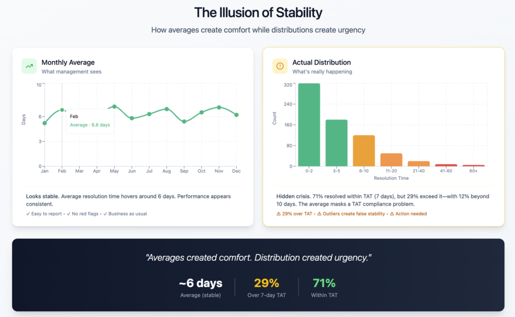
Averages masked variation. Aggregation hid concentration. The organization was measuring the surface of the problem, not its structure.
The Moment Something Felt Off
As auditors, our job isn’t just to confirm that metrics exist. It’s to test whether those metrics actually explain operational reality.
What bothered me was the mismatch between the reporting and the persistence of the issue.
If delays were truly distributed across the system, improvement would require broad restructuring. But the complaints we reviewed didn’t feel random. Patterns were emerging in the qualitative review that the aggregate numbers were smoothing out.
That instinct led us to reframe the question.
Instead of asking:
How long are complaints taking to resolve?
We asked:
Where are delays concentrating and what stages are breaking down?
That shift sounds small. It wasn’t. It changed the entire direction of the analysis.
Reframing the Diagnostic Lens
Once we moved away from averages, the picture sharpened quickly.
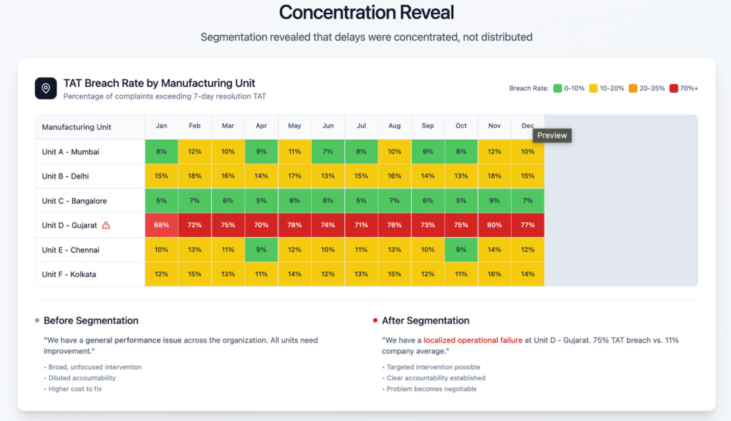
- We segmented complaints by manufacturing unit.
- We classified them by type.
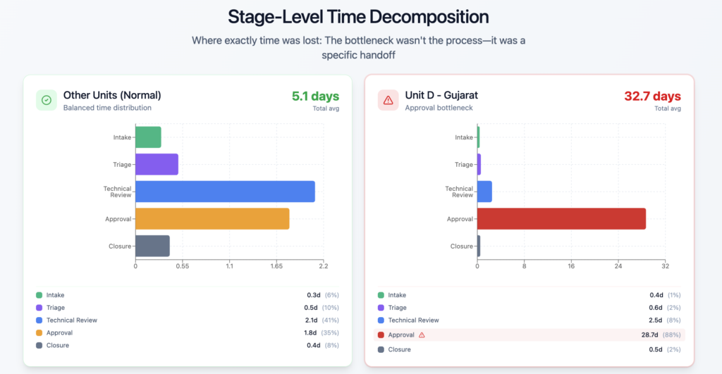
- We mapped the resolution lifecycle into stages instead of treating it as a single elapsed number.
- We looked at distributions rather than central tendency.
The initial dashboard told a story of gradual decline. The segmented analysis told a story of asymmetry.
One manufacturing unit was responsible for a disproportionate share of the delays. Within that unit, a specific stage in the resolution workflow consistently stalled. The issue wasn’t systemic across the company. It was localized and structural.
This is the moment when reporting turned into insight.
The organization didn’t have a generalized performance problem. It had a targeted operational failure. And once the failure had a location and a mechanism, the conversation shifted from frustration to intervention.
When Visualization Reveals What Averages Hide
Visual analytics played a critical role here, but not in the decorative sense people often associate with dashboards.
We weren’t trying to make prettier charts. We were trying to expose variation.
- A heatmap showing complaint delays by unit made the concentration impossible to ignore.
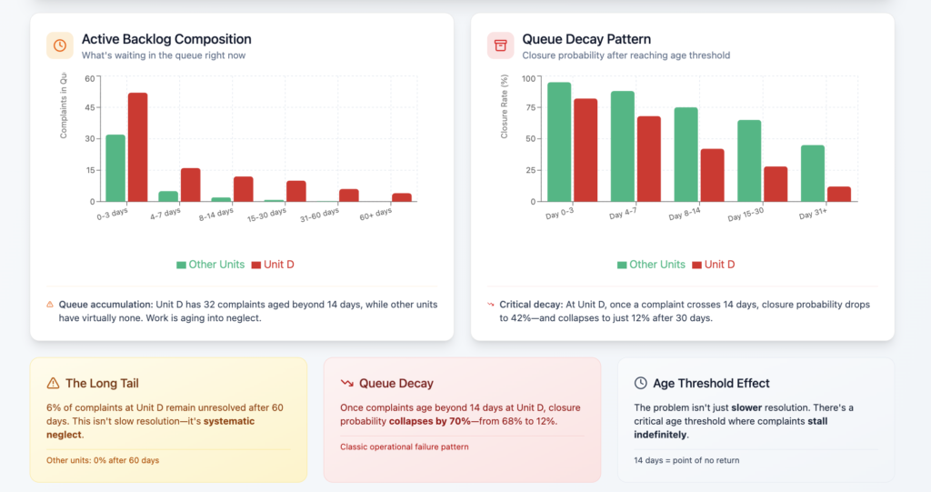
- A distribution curve revealed that the long tail was not noise, it was clustered.
- A stage-level breakdown made the bottleneck visible in seconds.
What changed wasn’t the data. It was the visibility of asymmetry.
Averages had created comfort. Distribution created urgency.
That’s an important lesson. Many organizations over-rely on summary statistics because they feel stable. But stability can be misleading. Insight often lives in the outliers, the segmentation and the unevenness that aggregated reporting smooths away.
Visualization didn’t create the insight. It removed the camouflage.
The Root Cause Becomes Negotiable
Once the concentration was clear, the investigation moved from analytical to operational.
- The specific manufacturing unit had a workflow dependency that routed certain complaint categories through a resource-constrained approval stage.
- Escalations piled up because ownership was diffused and capacity planning hadn’t kept pace with volume.
- No one individual was responsible for clearing the queue.
- The system assumed self-correction. It never came.
Before the deeper analysis, the organization believed it had a company-wide performance drift. After the analysis, it had a defined bottleneck, a location and a mechanism.
That difference is everything.
General problems invite general frustration. Specific problems invite specific decisions.
What was the decision taken.
- Within weeks, the unit restructured the approval flow,
- reassigned accountability, and
- redesigned escalation handling.
Resolution times began to normalize, not because the company suddenly cared more, but because the problem had been translated into a decision-ready form.
Why Most Analysis Stops Too Early
Looking back, the client’s original reporting wasn’t negligent. It was typical. Many analytics environments reward completeness and accuracy and not decisiveness. Teams are trained to summarize performance, not to interrogate structure.
Stopping early feels safe. It avoids stepping into recommendation territory. It keeps analysis descriptive rather than confrontational. But it guarantees that insight remains observational.
Decision-grade analysis requires one more step – connecting findings to consequence.
That step is uncomfortable because it implies ownership. Once an insight identifies a lever, someone must pull it. Once it isolates a failure point, someone must fix it. The analysis is no longer neutral; it’s directional.
And directional analysis demands action.
What Makes Insight Worth Acting On
From that audit and many others, I’ve come to use a simple internal test. An insight is worth acting on when it:
- It isolated the real source of variation instead of summarizing the average. The rising average resolution time created concern. Segmentation revealed the truth – delays were concentrated in one unit and one stage.
- It connected to a lever the organization could control. The issue wasn’t abstract performance. It was a fixable workflow bottleneck.
- It narrowed the decision space. The question shifted from “How do we improve everything?” to “How do we fix this?”
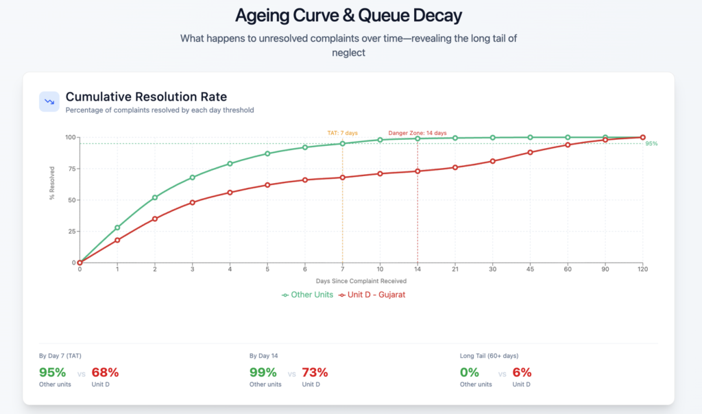
- It made inaction visibly costly. The ageing curve showed backlog decay, turning delay into measurable risk.
- It assigned responsibility. Once localized, the problem had an owner. It stopped being everyone’s issue and became someone’s decision.
Notice that none of these criteria require advanced tools. They require analytical intent. The goal isn’t sophistication; it’s consequence.
An insight earns its value when it changes what leadership is willing to do next.
The Larger Lesson
The organization we audited didn’t lack data. It lacked analysis designed to reveal consequence. Once the analysis crossed that boundary, the solution wasn’t controversial. It was obvious.
That’s the paradox of good insight. It doesn’t make decisions harder. It removes the ambiguity that kept them delayed.
Most business environments are saturated with reporting. Very few are saturated with decision-grade insight.
The difference isn’t technological. It’s philosophical. Are you analyzing to describe performance, or are you analyzing to shape choices?
Those are not the same activity.
Closing Reflection
If you want a simple way to test whether your analysis is finished, ask one question:
What decision should change because of this?
If the answer is unclear, the work isn’t done yet.
You don’t need more dashboards. You don’t need more metrics. You need insight that forces a choice. Because analysis that doesn’t influence decisions is commentary, no matter how polished it looks.
Insight becomes valuable at the moment it enters the decision itself.
Everything before that is preparation..
Leave a Reply