


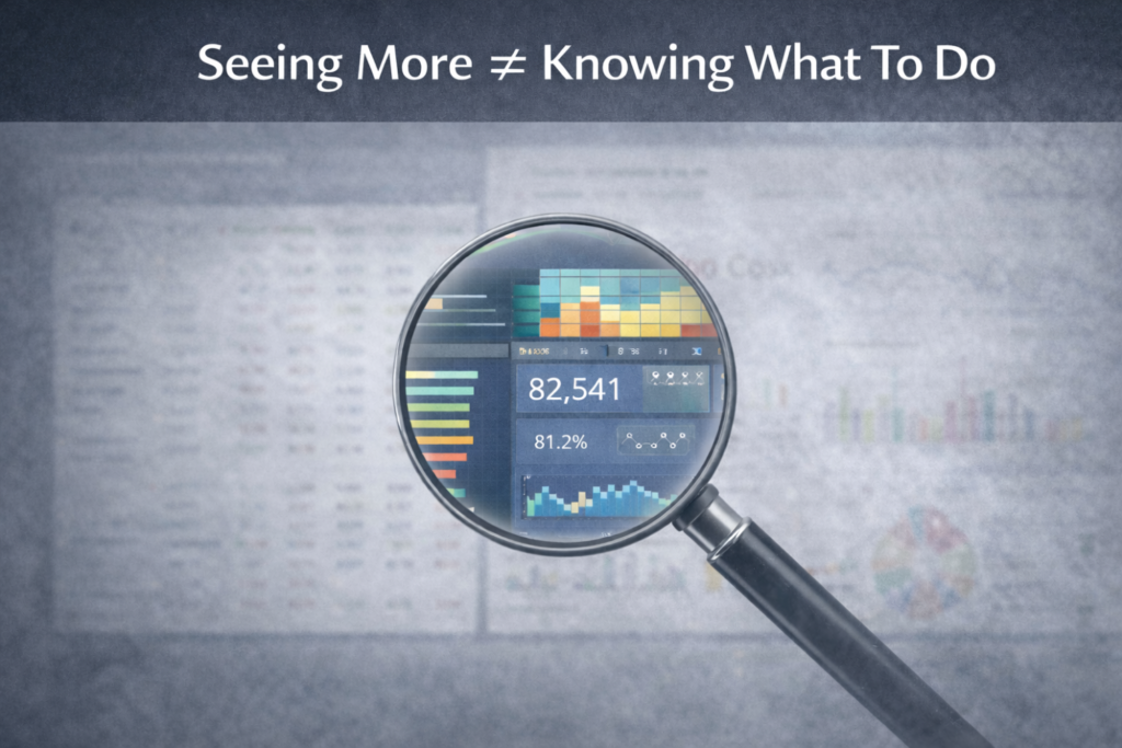
Dashboards don’t end debates because they provide data without context or interpretation, leading to discussions, misalignment, and delayed decisions.
Not long ago, I sat in a leadership meeting where the agenda included a familiar topic: cash flow. Highly important from the finance perspective, it included people from different business functions. Apparently, this meeting would happen every month focussing on health of the cash flow.
The CFO pulled up an Accounts Receivable dashboard. It showed DSO (Daily Sales Outstanding), aging buckets, overdue invoices, collection trends. Every relevant and important KPIs one would ask for.
Yet within minutes, the room split. There was murmuring all around.
One executive argued the issue was customer payment discipline. Another insisted the real problem was sales offering overly generous credit terms. A third believed billing delays were the root cause.
Everyone was looking at the same dashboard. And yet, no one felt confident enough to call the decision.
That meeting ended the way many leadership discussions do. There was more debate, more hypotheses but no clear course of action.
This meeting raises a broader question worth asking: If dashboards were truly working, why do executives still spend so much time arguing?

The Problem Isn’t Data. It’s Decision Ambiguity.
Most organizations believe that better dashboards lead to better decisions. Thus, they have tons and tons of dashboards created, for every single business function / processes. I see this phenomenon across industry- be it Insurance, Pharma, Retail or Manufacturing.
In practice, these dashboards often do the opposite. They create more conversation without reducing uncertainty.
Executives / Decision Makers debate because the dashboard doesn’t resolve the underlying decision tension.
In the Accounts Receivable example, the dashboard reported overdue invoices accurately. But it did not answer the real leadership question – Should we tighten credit, change sales behavior, fix billing operations or accept higher working capital as the cost of growth?
Without that clarity, data becomes fuel for opinion rather than a foundation for alignment.
Visibility Does Not Equal Clarity
Most dashboards are built to maximize visibility. They show trends, movements, comparisons and KPIs in impressive detail. Good tools, impressive visuals, varied colours.
But leadership teams are not struggling to see the numbers. They are struggling to interpret what the numbers imply for action.
In AR reviews, executives already know overdue receivables exist. The debate is about why they exist and what to do about them.
Is the problem:
- Customer risk?
- Sales incentives?
- Weak collections?
- Process inefficiency?
- Or a deliberate growth trade-off?
A dashboard that stops at reporting aging buckets is informative. A dashboard that explains which lever matters most right now is decision-enabling.
Why Executive Debates Persist Even With Dashboards
Across organizations, the pattern is consistent.
Dashboards often present too many metrics, but too few priorities. Leaders see volume, not focus.
Different functions interpret the same numbers through their own lenses. Finance sees working capital risk. Sales sees revenue enablement. Operations sees process friction. The dashboard does not reconcile these views. It unintentionally amplifies them.
Most dashboards emphasize historical outcomes. But leadership teams are accountable for future choices. Knowing that DSO worsened last quarter does not automatically tell them what to change next quarter. Most of the dashboards that we see are often Descriptive in nature and not Diagnostic.
And in many cases, dashboards are designed for analysts i.e. dense, comprehensive, technically correct but not structured around how executives actually make decisions. These occurances are due to lack of involvement from the functional team at the time of dashboard developement.
Meetings are filled with interpretations rather than resolution.
What Would a Better AR Dashboard Actually Do?
Imagine an Accounts Receivable dashboard designed not to display data, but to support a decision.
Instead of simply showing aging buckets, it might highlight:
- Which customer segment is driving the increase in overdue balances
- Whether the root cause is credit policy, billing delays or collections execution
- The financial impact of tightening credit versus maintaining current terms
- The trade-off between revenue growth and working capital strain
Now the leadership discussion shifts.
Instead of debating opinions, the room debates choices. Instead of asking “What’s happening?”, executives ask “Which option do we commit to?”
That is the difference between a dashboard that informs and one that guides leadership.

The Real Test of an Executive Dashboard
Here is a simple test.
If your leadership team reviews a dashboard and still debates direction for most of the meeting – the dashboard has not done its job.
A high-impact executive dashboard should reduce debate, not extend it. It should clarify trade-offs, not multiply interpretations. It should lead to a decision, not just a discussion.
If it only generates conversation, it may be visually impressive but it is strategically underperforming.

A Closing Thought for CFOs, CEOs and Analytics Leaders
If your Accounts Receivable dashboard disappeared tomorrow, would leadership decisions actually get worse or would the same debates still happen?
If the debates remain, the issue isn’t visualization or tooling.
It’s that the dashboard was never designed to settle decisions in the first place.ng to build your own portfolio or need help making your site work harder for you, this approach can offer a solid blueprint.
Leave a Reply