


Beautiful dashboards create false confidence, where design masks weak metrics and discourages questioning, leading to misleading decisions.
Over the past several months, as I have worked with finance leaders, founders and operating teams across growth-stage and mid-sized businesses, I have developed a view that is not always popular:
The more visually impressive a dashboard is, the more cautiously I examine it.
This is not a critique of design. Clarity in visualization matters. Executive dashboards must be intuitive. However, I have repeatedly observed a pattern – aesthetic sophistication often masks analytical shallowness. And when that happens, the dashboard becomes a source of comfort rather than a driver of decision quality.
That distinction is critical.
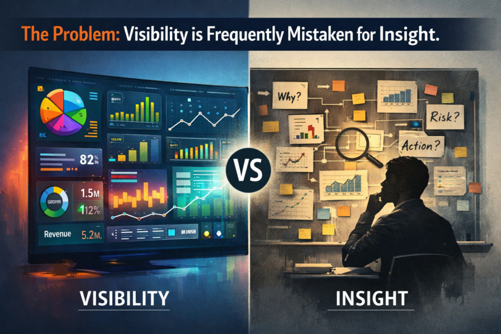
The Illusion of Visibility
Most organizations invest in dashboards to gain “visibility.” The intention is sound. Leaders want a consolidated, real-time view of performance across revenue, margins, working capital, pipeline and operations.
The problem is that visibility is frequently mistaken for insight.
A well-designed dashboard answers the question: What is happening?
A decision-grade dashboard must answer a more difficult question: What should we do differently because of what is happening?
In many boardrooms, I see dashboards that elegantly summarize historical performance but do not alter forward-looking decisions. Metrics are displayed. Trends are visible. Variances are highlighted. Yet no clear action is triggered.
When data presentation is not explicitly linked to decision architecture, it becomes observational rather than strategic.
The Comfort of Green
Color-coded dashboards create powerful psychological signals. Green implies control. Stability. Performance within tolerance.
But in several engagements, I have seen how “green” can coexist with deteriorating fundamentals.
Consider a situation where revenue growth remains strong and EBITDA margins are stable. At first glance, the business appears healthy. However, a deeper examination reveals that contribution margins by segment are compressing, customer acquisition costs are increasing, and the working capital cycle is lengthening.
The dashboard, focused on top-line growth and consolidated profitability, shows stability.
The underlying economics are weakening.
Similarly, I have seen Accounts Receivable dashboards reporting “within policy” performance while Days Sales Outstanding gradually increase due to concentration risk in a handful of customers. Inventory turnover appears stable at an aggregate level, yet SKU-level dead stock is accumulating and tying up capital.
The dashboard is technically accurate. But it does not surface structural risk.
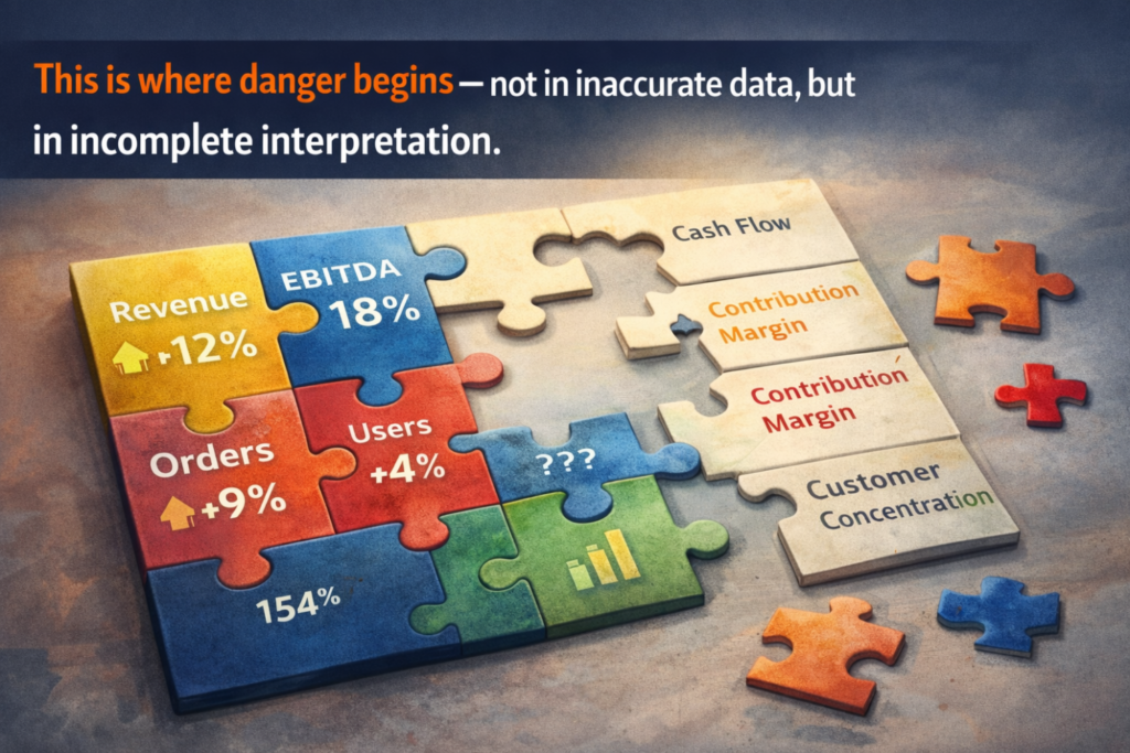
This is where danger begins – not in inaccurate data, but in incomplete interpretation.
The Aggregation Problem
One of the most common design choices in executive dashboards is aggregation. Portfolio-level margins, consolidated growth rates, average order values and overall churn rates are visually clean and easy to digest.
However, aggregation reduces complexity at the expense of truth.
Risk rarely resides in averages. It resides in dispersion.
In several multi-entity or multi-location businesses I have advised, consolidated profitability appeared acceptable. Yet when performance was disaggregated by unit, geography, or product line, a significant percentage of the business was underperforming or destroying value.
The average concealed the distribution.
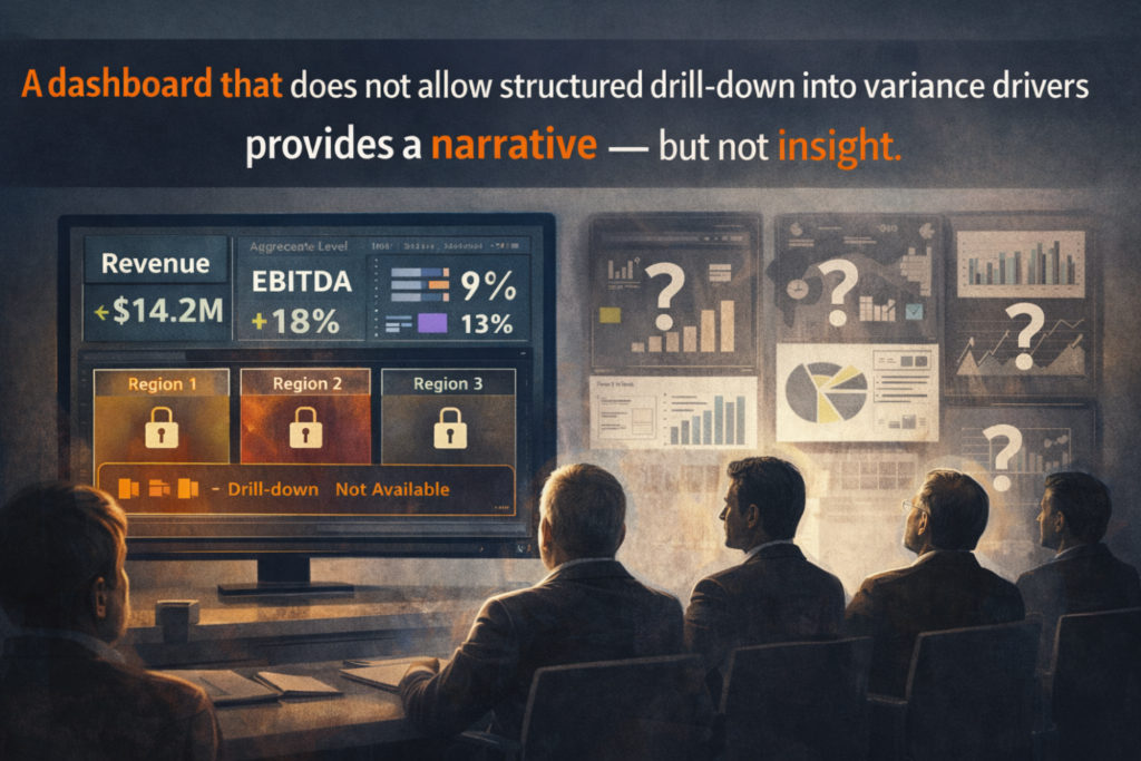
A dashboard that does not allow structured drill-down into variance drivers provides a narrative but not insight.
From a capital allocation perspective, that distinction matters enormously.
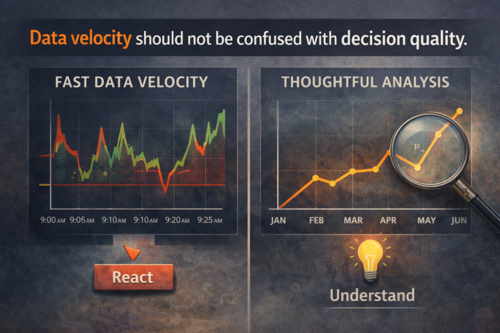
Real-Time Data and the Illusion of Control
There is also a growing fascination with real-time dashboards. Data refreshing every few minutes conveys a sense of control and operational sophistication.
However, I have observed that real-time visibility can create reactive management behavior. Leadership teams begin responding to short-term fluctuations that have limited structural relevance. Noise is mistaken for signal. Micro-variations trigger tactical adjustments that may undermine longer-term strategy.
In finance and operations, not every metric benefits from minute-level refresh rates. Many performance drivers such as margin structure, customer lifetime value, working capital efficiency require analytical depth rather than speed.
Data velocity should not be confused with decision quality.
The Political Economy of Dashboards
Another dimension that deserves attention is the governance of metrics.
Dashboards are not neutral artifacts. They reflect choices: which KPIs are included, how they are defined, what level of granularity is exposed and which breakdowns are omitted.
In practice, dashboards often evolve within organizational politics. Functions emphasize metrics that reflect favorably on their performance. Risk exposure may be diluted through aggregation. Difficult conversations are softened through presentation.
A highly polished dashboard can create an aura of completeness that discourages questioning. When the presentation is sophisticated, executives may be less inclined to challenge underlying assumptions.
In such cases, design becomes a shield rather than a lens.
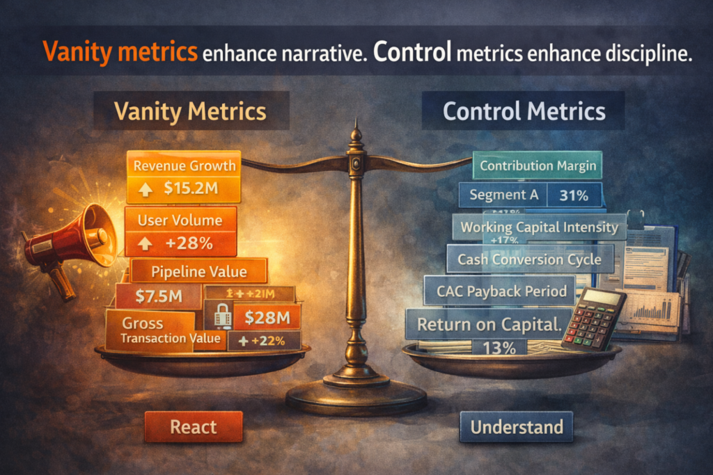
Vanity Metrics vs. Control Metrics
In my experience, many dashboards overemphasize what I would describe as vanity metrics – numbers that are directionally positive but weakly connected to economic control.
Revenue growth, user acquisition, pipeline volume or gross transaction value may look impressive. They are easy to visualize and communicate.
However, sustainable value creation depends more heavily on control metrics: contribution margins by cohort, cash conversion cycle, working capital intensity, customer acquisition payback period, repeat purchase quality and return on invested capital.
Vanity metrics enhance narrative. Control metrics enhance discipline.
When dashboards prioritize the former, leadership conversations become optimistic but not necessarily rigorous.
The Absence of Decision Architecture
The most significant structural weakness I encounter is the absence of explicit decision architecture.
Before constructing or redesigning a dashboard, I now insist on clarity around five questions:
- What specific recurring decisions does leadership need to make?
- Which metric directly informs each decision?
- What threshold requires intervention?
- Who is accountable for corrective action?
- What is the economic consequence of inaction?
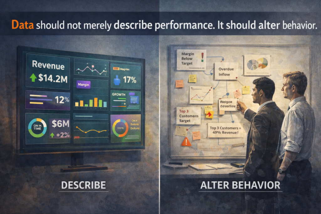
If these questions are not answered upfront, the dashboard is likely to become a reporting instrument rather than a strategic one.
Data should not merely describe performance. It should alter behavior.
Without defined triggers and ownership, even the most elegant dashboard becomes passive.
What a Decision-Grade Dashboard Looks Like
A robust executive dashboard is typically less crowded and less visually dramatic than expected.
It emphasizes:
- A small set of economically material metrics
- Clear thresholds linked to action
- Explicit linkage to cash and capital efficiency
- Drill-down capabilities to uncover root causes
- Visibility into concentration and dependency risks
- Scenario-based views to test sensitivity
Importantly, it introduces productive discomfort. It surfaces structural vulnerabilities, not just performance achievements.
The objective is not reassurance. It is clarity.
A Practical Reflection
When I review a dashboard today, I ask myself:
- Does this highlight structural risk or merely summarize performance?
- Does it expose dispersion, or does it rely heavily on averages?
- Does it connect operational metrics to capital allocation decisions?
- Would a 10% adverse movement in a key metric visibly alter management behavior?
If the answer to these questions is unclear, the dashboard may be aesthetically strong but strategically weak.
Closing Thought
There is nothing inherently wrong with beautiful dashboards. Design discipline enhances usability and comprehension.
The risk arises when visual sophistication substitutes for analytical rigor.
In business, elegance without economic depth can create false confidence. And false confidence delays corrective action.
The true purpose of analytics is not to make performance look coherent. It is to sharpen decision quality under uncertainty.
The most valuable dashboards I have encountered are not necessarily the most visually impressive. They are the ones that change conversations, challenge assumptions, and connect metrics directly to money.
That is where real power lies. Not in color palettes or animations, but in disciplined thinking.
Leave a Reply