



A practical framework to audit dashboards, improve data trust, enhance adoption, and transform reporting into decision intelligence.
Organizations spend millions on dashboards, BI platforms, and analytics initiatives. Yet executives still walk into meetings arguing over numbers, analysts continue exporting data to Excel, and business users often abandon dashboards altogether.
The problem isn’t the absence of data. The problem is that most organizations have never audited their dashboard ecosystem.
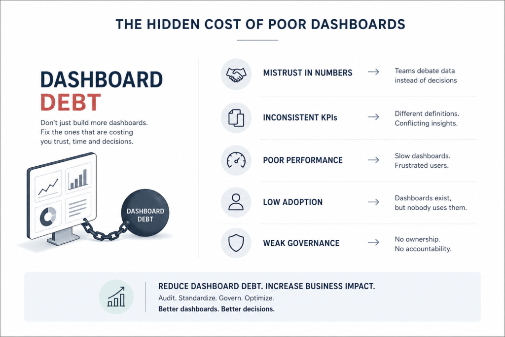
Over time, dashboards proliferate. Teams create their own reports, metrics evolve without documentation, duplicate KPIs emerge, and performance deteriorates. What starts as a business intelligence initiative gradually turns into an ecosystem nobody fully trusts.
The result?
Meetings become debates over numbers rather than discussions about actions.
If this sounds familiar, your organization may be suffering from what can best be described as dashboard debt.
Just as technical debt accumulates in software development, dashboard debt accumulates across analytics environments. Left unchecked, it erodes trust, reduces adoption, and prevents organizations from realizing the value of their BI investments.
The solution isn’t building more dashboards. It is auditing the ones you already have.
Why Dashboard Audits Matter
Most BI initiatives focus heavily on implementation:
- Selecting Power BI, Tableau, or Looker.
- Building data pipelines.
- Creating visualizations.
- Publishing reports.
Very few organizations spend enough time asking:
- Are these dashboards solving the right business problems?
- Do users actually trust the numbers?
- Are KPIs consistently defined?
- Is performance acceptable?
- Are users adopting the reports?
- Are there duplicate or redundant dashboards?
Without answering these questions, even technically sophisticated dashboards can fail.
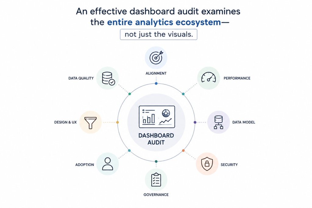
An effective dashboard audit examines the entire analytics ecosystem—not just the visuals.
It evaluates business alignment, data quality, KPI consistency, usability, performance, governance, security, and adoption.
Step 1: Business Alignment Review
A dashboard that doesn’t drive decisions is merely a digital decoration.
Before examining metrics and visuals, organizations should first understand:
- Who uses the dashboard?
- Why does it exist?
- Which decisions does it support?
Typically, dashboards serve three levels of users:
a. Strategic Users
CXOs and senior leadership seeking high-level performance indicators.
b. Tactical Users
Regional heads and business managers monitoring functional performance.
c. Operational Users
Teams in marketing, supply chain, finance, or operations who need detailed execution metrics.
An audit should examine:
- KPI relevance and actionability.
- Alignment with business objectives.
- Decisions enabled by the dashboard.
- Presence of duplicate or unnecessary metrics.
- Actual stakeholder adoption.
Many dashboards contain dozens of metrics simply because they can. However, more information rarely translates into better decisions.
In fact, excessive KPIs often create confusion rather than clarity.
Step 2: Data Quality Audit
Even the most beautiful dashboard becomes worthless if the underlying data cannot be trusted.
The audit should begin with a comprehensive source system inventory.
Common enterprise sources include:
a. Digital Platforms
- E-commerce systems
- Mobile applications
- Google Analytics 4 (GA4)
b. Customer and Operations Systems
- CRM
- ERP
- OMS
- WMS
- POS systems
c. Support Platforms
- Ticketing systems
- Service management applications
Once lineage is established, six dimensions of data quality should be evaluated.
1. Completeness
Are records missing?
Do pipeline failures create gaps?
2. Accuracy
Do dashboard aggregates reconcile with source systems?
3. Consistency
Does the same metric produce identical values across dashboards?
4. Timeliness
Is the refresh frequency aligned with business requirements?
5. Duplication
Are transactions or customers being counted twice?
6. Definition Integrity
Are business rules consistently implemented?
Many organizations discover that conflicting numbers stem not from incorrect data but from inconsistent metric definitions.
Step 3: KPI and Metric Audit
Metrics represent the language of business. When that language lacks standardization, confusion becomes inevitable. A KPI audit should establish a centralized inventory across major domains.
a. Revenue Metrics
- Gross revenue
- Net revenue
- Average Order Value
- Revenue per customer
- Online sales
- Store sales
b. Customer Metrics
- New customers
- Repeat customers
- Retention rate
- Customer Lifetime Value
- NPS
- CSAT
c. Marketing Metrics
- Customer Acquisition Cost
- ROAS
- Conversion rates
- Funnel drop-offs
d. Operations Metrics
- Fulfillment rates
- Inventory turnover
- Return rates
- Stock-out percentages
The most important question is: Is there a KPI dictionary?
Without a centralized definition repository, every team eventually creates its own interpretation of the same metric.
That is often where trust begins to collapse.
Step 4: Dashboard Design and User Experience Audit
Insights are only valuable if users can discover them quickly. A dashboard should communicate information naturally.
Effective layouts follow a hierarchy:
- Critical KPIs at the top.
- Trend analysis in the middle.
- Detailed tables and drill-down sections below.
An audit should identify:
- Visual clutter.
- Excessive whitespace.
- Poor navigation.
- Mobile usability issues.
- Lack of information hierarchy.
Several common design mistakes repeatedly appear across organizations:
a. Too Many Pie Charts
Pie charts are effective only when comparing a small number of categories.
b. Inconsistent Colors
Colors should have universal meanings. Green should consistently imply positive performance, and red should indicate exceptions.
c. Missing Targets
Numbers without benchmarks provide little context.
d. Excessive Scrolling
Users should not need multiple screens to answer simple questions. Good dashboards reduce cognitive effort. Poor dashboards increase it.
Step 5: Filter and Interaction Audit
Filters represent how users converse with data. Poor filter design frustrates users and slows performance.
One useful principle is the Three-Click Rule. Users should be able to answer common business questions in three clicks or fewer.
The audit should evaluate:
- Filter relevance.
- Logical arrangement.
- Default selections.
- Personalization options.
- Drill-down behavior.
Particular attention should be given to cascading filters.
For example: Selecting a region should automatically limit store selections to that region. Without cascading logic, users frequently encounter empty results and confusing experiences.
Step 6: Performance Audit
No matter how sophisticated a dashboard may be, users will abandon it if it is slow.
Performance benchmarks generally include:
| Component | Target |
|---|---|
| Initial Load | Under 5 seconds |
| Filter Response | Under 2 seconds |
| Drill Down | Under 3 seconds |
| Refresh Window | Within SLA |
Common causes of poor performance include:
- Heavy calculated fields.
- Excessive joins.
- High-cardinality dimensions.
- Unused columns.
- Inefficient semantic models.
Many performance issues originate upstream. Calculations that belong in SQL or the data warehouse are often unnecessarily pushed into Power BI or Tableau.
Moving logic closer to the data layer can significantly improve responsiveness.
Step 7: Data Model Audit
Behind every dashboard lies a data model. If that model is poorly designed, both performance and accuracy suffer.
The audit should review:
- Star schema versus snowflake architecture.
- Fact table granularity.
- Relationship structures.
Several anti-patterns deserve immediate attention.
a. Duplicate Metric Logic
Different tables calculating the same measure differently.
b. Circular Relationships
Confusing query paths that create unexpected results.
c. Fact-to-Fact Joins
Leading to inflated values and duplicate records.
d. Complex Nested Calculations
Logic that should reside in SQL or dbt models. Clean data models are often invisible. Messy ones eventually become everyone’s problem.
Step 8: User Adoption Audit
Dashboards create value only when people use them. Usage analytics provide an objective view of adoption.
Organizations should monitor:
- Monthly Active Users.
- Dashboard views.
- Feature usage.
- Frequently accessed tabs.
Every dashboard can then be classified into four categories:
1. Strategic
High-value executive dashboards.
2. Tactical
Managerial reporting environments.
3. Operational
Daily execution dashboards.
4. Retire
Unused or redundant reports. Many organizations are surprised to discover that nearly 30–40% of dashboards have minimal usage. Retiring those reports reduces complexity and improves governance.
Step 9: Governance Audit
Sustainable analytics requires ownership.
Three roles should always exist:
1. Business Owner
Defines KPI meanings.
2. Data Owner
Maintains source systems and pipelines.
3. BI Owner
Manages reports and visualizations.
Governance should also ensure the presence of:
- Business Requirement Documents.
- KPI dictionaries.
- Data dictionaries.
- Source mappings.
- Refresh schedules.
- User access matrices.
- Change management processes.
Without governance, dashboard quality inevitably deteriorates over time.
Step 10: Security and Access Audit
As dashboards increasingly contain sensitive customer and financial information, security becomes critical.
Key controls include:
a. Role-Based Access Control (RBAC)
Users should access only information relevant to their responsibilities.
b. Row-Level Security (RLS)
Store managers should see only their stores, while regional leaders view broader territories.
c. PII Protection
Sensitive customer information must be masked.
d. Export Permissions
Raw data downloads should be tightly controlled.
e. Access Monitoring
Audit logs should detect unusual usage patterns. Security cannot be treated as an afterthought. It must be embedded into the dashboard architecture.
Step 11: Omnichannel Analytics Audit
Modern businesses operate across multiple channels. Retailers, banks, manufacturers, and service organizations all require integrated visibility.
An omnichannel audit evaluates cross-functional metrics across:
a. E-Commerce
Traffic, conversions, and funnel drop-offs.
b. Physical Stores
Footfall and store conversion.
c. Supply Chain
Inventory accuracy and fulfillment performance.
d. Manufacturing
Production volume and quality.
e. Customer Support
Resolution time and customer satisfaction.
f. Marketing
CAC, ROAS, and attribution.
g. Finance
Profitability and margin analysis.
Disconnected channel reporting often creates fragmented decision-making. An integrated view creates enterprise-wide visibility.
Turning Findings into Action
A dashboard audit should produce more than observations. It should create tangible deliverables.
a. Dashboard Inventory
A complete catalog of dashboards, owners, purpose, and usage.
b. KPI Audit Matrix
Mapping: KPI → Definition → Source → Owner → Status
c. Dashboard Scorecard
Evaluating:
- Business alignment
- Data quality
- UX
- Performance
- Governance
- Adoption
- Security
d. Recommendation Roadmap
Quick Wins (0–30 Days)
- Remove unused KPIs.
- Fix filter issues.
- Standardize colors.
Medium-Term Improvements (30–90 Days)
- Consolidate duplicate dashboards.
- Standardize KPI calculations.
- Optimize semantic models.
Strategic Initiatives (90+ Days)
- Enterprise KPI governance.
- Data dictionaries.
- Certified datasets.
- Self-service analytics models.
Final Thoughts
Organizations rarely fail because they lack dashboards. They fail because they lack trust in them. When leaders spend more time debating numbers than discussing actions, analytics has lost its purpose.
A dashboard audit restores that trust. It transforms dashboards from reporting tools into decision systems. Because the objective of business intelligence isn’t to produce more charts. It is to help organizations make better decisions.
Leave a Reply